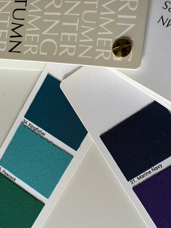
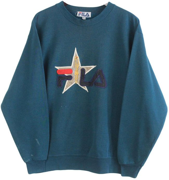
Today I’m wearing a sweatshirt in a color that perfectly mixes our autumn palette’sKingfisher and Marine Navy, with a hint of Peacock.
Some might say it’s just turquoise.
I say it’s a vintage 90s deep teal, and it may as well be covered in tears. I picked up this used sweatshirt from Etsy in a whirlwind of purchases after I learned (too late) that my beloved Fila has closed its U.S. operations. Fila was my go-to late-night shopping indulgence, my yearly birthday shoes, my dye bases, my every sweatpant short. I own three Grant Hills. What do I do now?!
Fila’s U.S. website says they’re “taking a break,” but I don’t trust they’ll be back any time soon.
So, what’s your favorite fashion brand these days?
Love,
Em
P.S. Also… do you have any recommendations for a nostalgic, sporty streetwear brand with cloud-comfort, ostentatious shoes and any hope of purchasing in the U.S.?
The first time I dyed the sweatshirt, I didn’t know what I was doing. I reused a dye mix from a batch earlier that day, just let it soak for half the time, only added half the bottle, and didn’t use a dye fixative. You must use a dye fixative unless you want the color (and your hard work) to ooze out. For a short while, I tried to convince myself that the dyed sweatshirt looked like an artisanal tea neutral, but soon realized that it too closely resembled my pale skin tone; I felt like I was in a Cronenberg body horror where I finally became one with Fila. It’ll happen someday. After the second, more deliberate, attempt, the sweatshirt is now a true dark brown.
Using dark brown again, I changed this beloved THE KIT top from “smokey lilac” to a brownish, smokier lilac. The Potato Professor background is also still beloved and continues to make an appearance.
As another win (and maybe the favorite), I dyed my Thakoon for Target dress a Sage green. The original print thankfully still comes through.
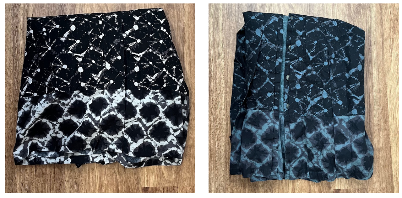
My foray into non-brown or green colors has proven less successful in my attempts to autumn-up my wardrobe. The swatches below show a dress’s fabric turned from a black/white/brown print to an intended deep eggplant (but now fuchsia).
Do you know any Clear Winters who need a flowy summer dress? Fuchsia / haute pink is all the rage.
Love,
Em
P.S. A lot of my Fila love comes from my switch to ostentatious flats after my first MS attack and the need for the comfiest fashion shoes ever. Disease Is a Mirror, my lyric memoir about diagnosis, publishes as an eBook on October 3, 2023 and includes excerpts from our DorEm Answers shenanigans. Save the date.
I’m excited to hear that you think you’re a Winter. Bright colors abound!
Let me introduce you to hot pink and start with its disciple, Pierpaolo Piccioli of Valentino. See Valentino’s Fall/Winter 2022 collection, in which Piccioli shows that hot pink is an equal staple to black.
Valentino Pink PP is now it’s own Pantone shade. According to British Vogue, Pierpaolo Piccioli was:
“… fuelled by a desire to create a lasting shade that would communicate the legacy of Rosso [red] Valentino through a modern lens.”
And so he did. Hot pink is redder than red; it’s vibrant, daring, goth.
Hot pink is like science fiction. There’s a hot pink pigment that technically exists, but its vibrancy can’t be captured in film.
I wish I could twin with you on a hot pink quest.
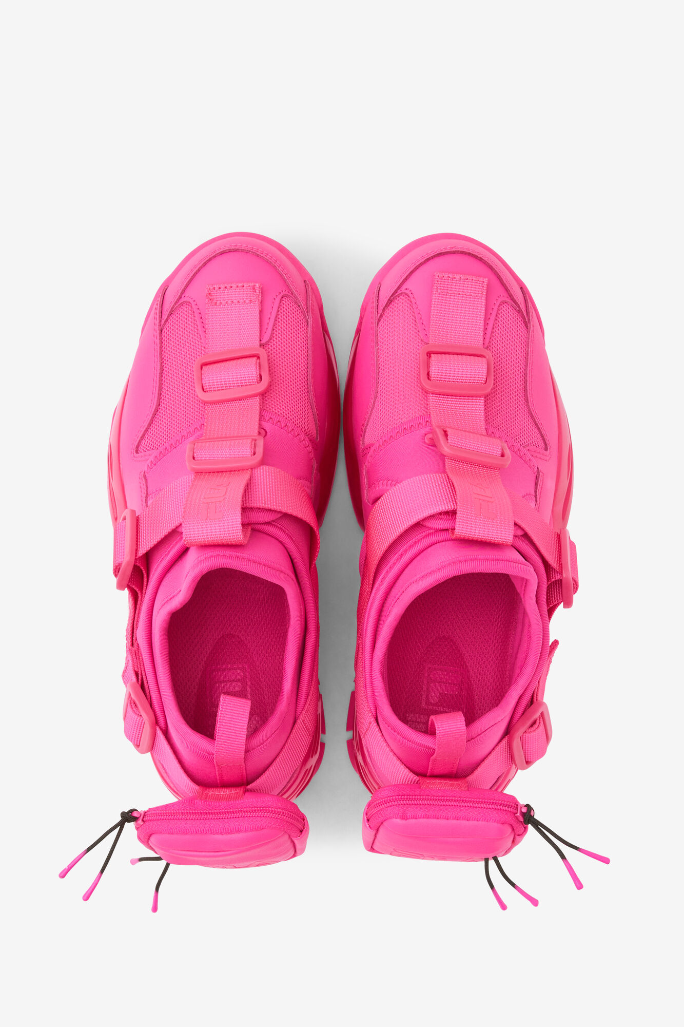
Leaning into my Soft Summer palette of muted colors, greys abound and hot pink is currently relegated to the furthest reaches of my body. For example, these hot pink sneakers from Fila are especially comfortable and the mini heel backpacks hold enough change for the parking meter and the arcade at our local movie theatre.
If you’re looking for options closer to your face, I point back to our At Least Two Pair correspondence, where I piled on the wishful thinking and multiple bright sweaters from Loft. They’re still on sale, and the Fuchsia looks especially bright.
The most recent Valentino Haute Couture collection (Spring/Summer 2023) still includes pops of neon in yellow, green, teal, orange, blue, and the beloved hot pink. However, the vibrancy is no longer head to toe. I especially connected with the looks that paired the neon with muted tones, so us Summers aren’t completely left in the dark.